Data Analytics & Visualisation

Challenge 1: Percentage vaccinated / Percentage voting for Trump
The purpose of this challenge is to reproduce a plot using dplyr and ggplot2 skills.
Read the article The Racial Factor: There’s 77 Counties Which Are Deep Blue But Also Low-Vaxx. Guess What They Have In Common? and have a look at the attached figure.
- To get vaccination by county, we will use data from the CDC
- You need to get County Presidential Election Returns 2000-2020
- Finally, you also need an estimate of the population of each county
# Download CDC vaccination by county
cdc_url <- "https://data.cdc.gov/api/views/8xkx-amqh/rows.csv?accessType=DOWNLOAD"
vaccinations <- vroom(cdc_url) %>%
  janitor::clean_names() %>%
  filter(fips != "UNK") # remove counties that have an unknown (UNK) FIPS code

# Download County Presidential Election Returns
# https://dataverse.harvard.edu/dataset.xhtml?persistentId=doi:10.7910/DVN/VOQCHQ
election2020_results <- vroom(here::here("data", "countypres_2000-2020.csv")) %>%
  janitor::clean_names() %>%

  # just keep the results for the 2020 election
  filter(year == "2020") %>%

  # change original name county_fips to fips, to be consistent with the other two files
  rename (fips = county_fips)

# Download county population data
population_url <- "https://www.ers.usda.gov/webdocs/DataFiles/48747/PopulationEstimates.csv?v=2232"
population <- vroom(population_url) %>%
  janitor::clean_names() %>%

  # select the latest data, namely 2019
  select(fips = fip_stxt, pop_estimate_2019) %>%

  # pad FIPS codes with leading zeros, so they are always made up of 5 characters
  mutate(fips = stringi::stri_pad_left(fips, width=5, pad = "0"))
#we are going to take a look at the data first and then we will have to merge the data
population_vaccinations <- left_join(population, vaccinations, by="fips")
pve <- left_join(population_vaccinations, election2020_results, by="fips")
# we will group pve by county
pve %>%
filter(date =="08/03/2021") %>%
filter(candidate == "DONALD J TRUMP") %>%
filter(series_complete_pop_pct > 1) %>%
mutate(percentage_trump= candidatevotes/totalvotes*100) %>%
filter(percentage_trump > 1) %>%
ggplot(aes(x=percentage_trump, y=series_complete_pop_pct)) +
geom_point(aes(size = pop_estimate_2019))+
scale_size_continuous(range = c(0.01, 5))+
xlim(0,100)+
ylim(0,100)+
labs(title = "COVID-19 vaccination out of total population by county ",
x = "2020 Trump Vote %",
y = "Percentage of Total Population Vaccinated",
caption = "Centers for Disease Control, COVID Act NOW, state health depts")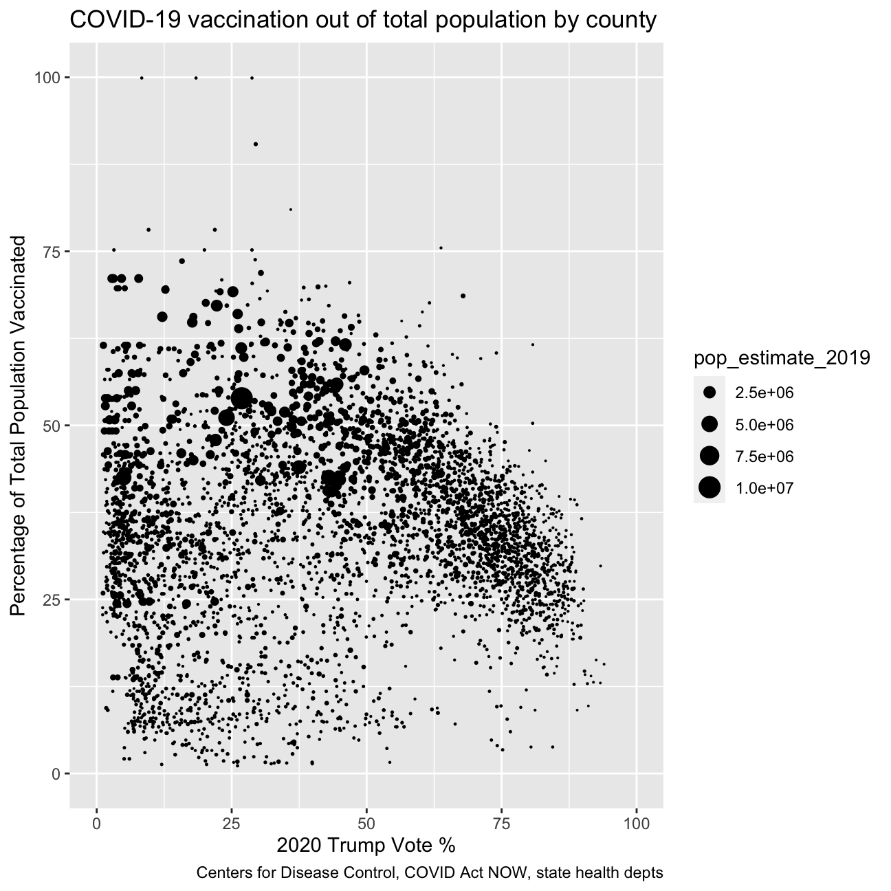
Challenge 2: Excess rentals in TfL bike sharing
We will be working on the TfL (Transports for London) data, and specifically on how many bikes were hired every single day. We can get the latest data by running the following
url <- "https://data.london.gov.uk/download/number-bicycle-hires/ac29363e-e0cb-47cc-a97a-e216d900a6b0/tfl-daily-cycle-hires.xlsx"
library(disk.frame)
# Download TFL data to temporary file
httr::GET(url, write_disk(bike.temp <- tempfile(fileext = ".xlsx")))
## Response [https://airdrive-secure.s3-eu-west-1.amazonaws.com/london/dataset/number-bicycle-hires/2021-08-23T14%3A32%3A29/tfl-daily-cycle-hires.xlsx?X-Amz-Algorithm=AWS4-HMAC-SHA256&X-Amz-Credential=AKIAJJDIMAIVZJDICKHA%2F20210919%2Feu-west-1%2Fs3%2Faws4_request&X-Amz-Date=20210919T163941Z&X-Amz-Expires=300&X-Amz-Signature=8669a03cc3a7de01dceb9f5ae1b5ef1ae54109d41dceb831717a58be0dba263f&X-Amz-SignedHeaders=host]
## Date: 2021-09-19 16:39
## Status: 200
## Content-Type: application/vnd.openxmlformats-officedocument.spreadsheetml.sheet
## Size: 173 kB
## <ON DISK> /var/folders/9l/m55q3p1j0z5b8bqn0kvk02b00000gn/T//RtmpMZ5NzO/file949535d32fe.xlsx# Use read_excel to read it as dataframe
bike0 <- read_excel(bike.temp,
sheet = "Data",
range = cell_cols("A:B"))
# change dates to get year, month, and week
bike <- bike0 %>%
clean_names() %>%
rename (bikes_hired = number_of_bicycle_hires) %>%
mutate (year = year(day),
month = lubridate::month(day, label = TRUE),
week = isoweek(day))We can easily create a facet grid that plots bikes hired by month and year.
knitr::include_graphics("/img/blogs/tfl_distributions_monthly.png", error = FALSE)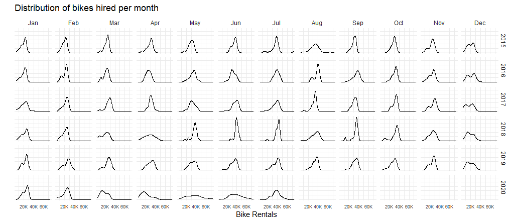
Look at May and Jun and compare 2020 with the previous years. What’s happening?
It becomes clear that the effect of national restrictive measures such as lockdowns have greatly influenced the bikes rent. This helps us explain the difference between the average number of rented bikes in May and June 2020 with previous years.
actual_bike <- bike %>%
               filter (year >= 2016) %>%
               group_by(year,month) %>%
               summarise(actual = mean(bikes_hired))

expected_bike <- actual_bike %>%
                 group_by(month) %>%
                 summarise(expected = mean(actual))

comparison_bike <- left_join(actual_bike, expected_bike, by = "month")

comparison_bike
## # A tibble: 67 × 4
## # Groups: year [6]
## year month actual expected
## <dbl> <ord> <dbl> <dbl>
## 1 2016 Jan 18914. 19763.
## 2 2016 Feb 20608. 21433.
## 3 2016 Mar 21435 22491.
## 4 2016 Apr 25444. 27392.
## 5 2016 May 32699. 33163.
## 6 2016 Jun 32108. 36618.
## 7 2016 Jul 38336. 37974.
## 8 2016 Aug 37368. 34955.
## 9 2016 Sep 35101. 33994.
## 10 2016 Oct 30488. 29660.
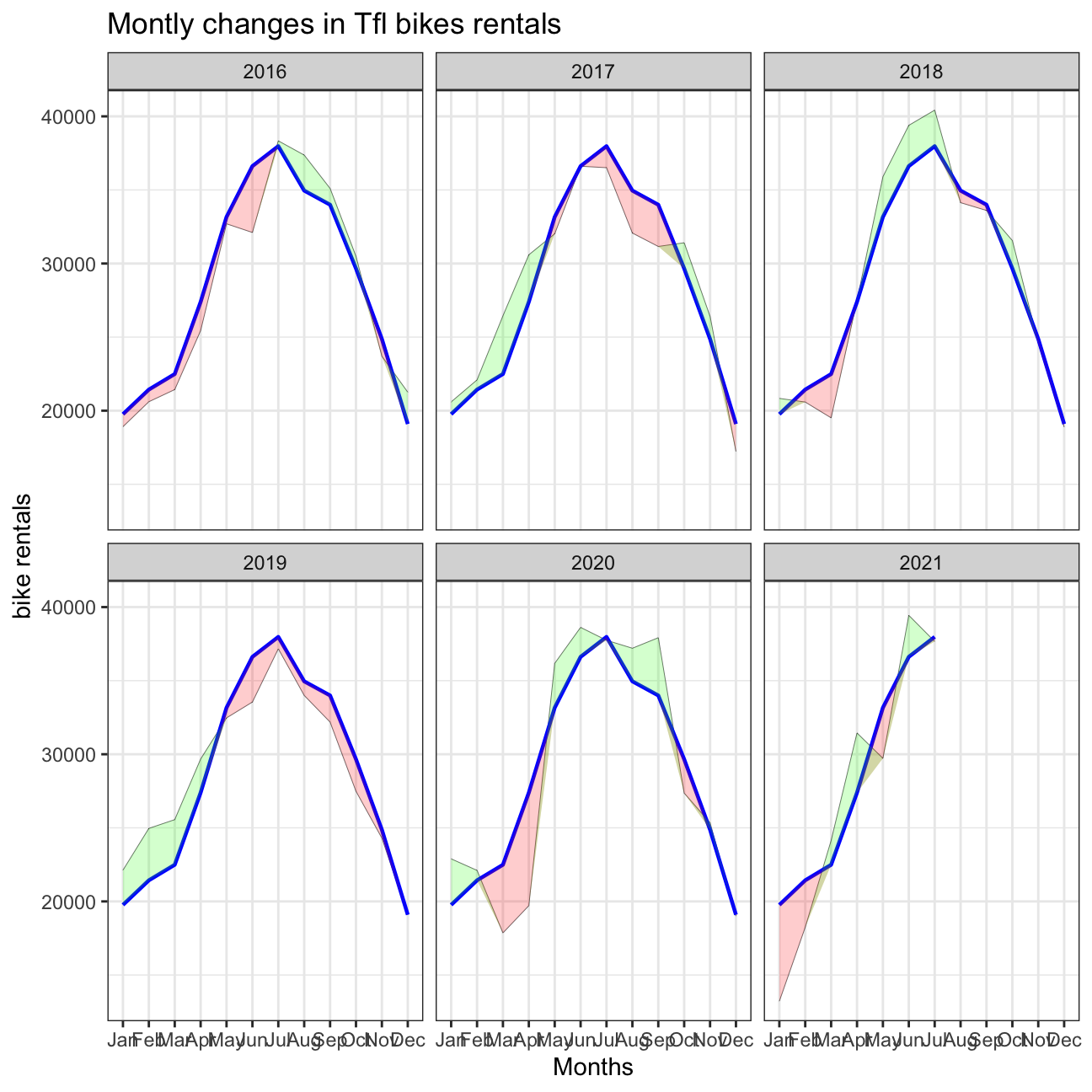
## # … with 57 more rowscomparison_bike %>%
ggplot(aes(x = month, group = 1)) +
geom_line(aes(x = month, y = actual), color = "black", size = 0.1) +
geom_line(aes(x = month, y = expected), color = "blue", size = 0.8) +
geom_ribbon(aes(ymin = expected, ymax = pmin(expected, actual)),fill = "red", alpha=0.2) +
geom_ribbon(aes(ymin = actual, ymax = pmin(expected, actual)),fill = "green", alpha=0.2)+
facet_wrap(~ year) +
theme_bw()+
labs(
title= "Montly changes in Tfl bikes rentals",
y="bike rentals",
x="Months"
)
actual_bike_w <- bike %>%
               filter (year >= 2016) %>%
               group_by(year, week) %>%
               summarise(actual = mean(bikes_hired))

expected_bike_w <- actual_bike_w %>%
                 group_by(week) %>%
                 summarise(expected = mean(actual))

comparison_bike_w <- left_join(actual_bike_w, expected_bike_w, by = "week") %>%
                     group_by(week) %>%
                     mutate(dchanges = (actual - expected) / expected )

comparison_bike_w = comparison_bike_w %>%
  filter(!(year ==2021 & week ==53))
comparison_bike_w %>%
ggplot(aes(x = week, group = 1)) +
geom_line(aes(x = week, y = dchanges, fill = "black")) +
geom_ribbon(aes(ymin = 0, ymax = pmin(0, dchanges)),fill = "red", alpha=0.2) +
geom_ribbon(aes(ymin = dchanges, ymax = pmin(0, dchanges)),fill = "green", alpha=0.2)+
facet_wrap(~ year) +
theme_bw()+
labs(
title= "Weekly changes in Tfl bikes rentals",
y= "Bikes rentals",
x="Weeks"
)
Should you use the mean or the median to calculate your expected rentals? Why? > In order to calculate the expected rentals we used the mean of rented bikes/montly since we thought this was a better measurement. Since the monthly data of the actual rented bikes does not seem to be heavily right/left skewed, the mean is a good tool to calcukate the expected rentals. If the data were heavily skewed, we would have changed to the median.
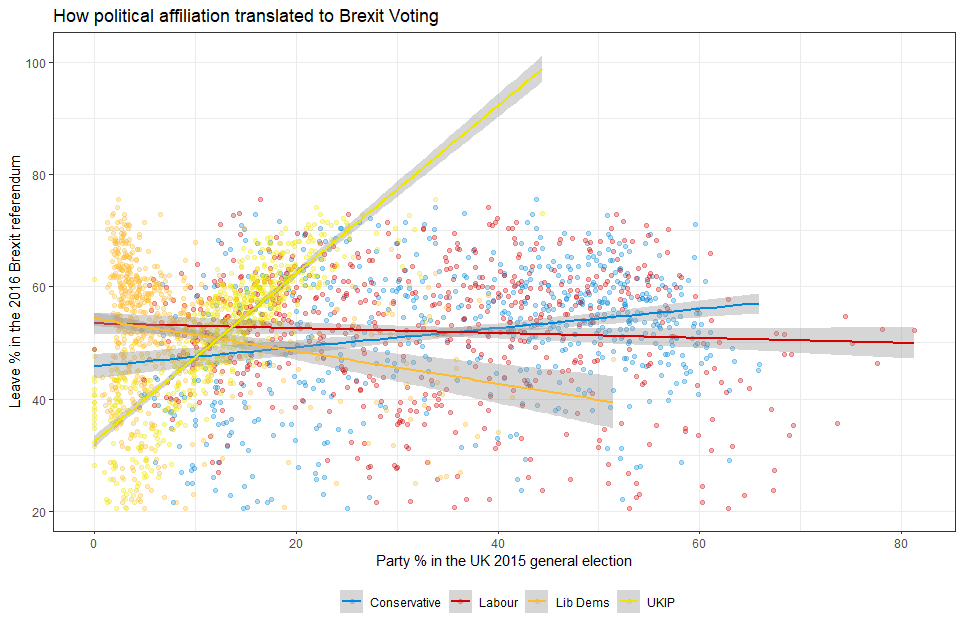
Challenge 3: Brexit voting
Using your data manipulation and visualisation skills, please use the Brexit results dataframe (the same dataset you used in the pre-programme assignement) and produce the following plot. Use the correct colour for each party; google “UK Political Party Web Colours” and find the appropriate hex code for colours, not the default colours that R gives you.
# load data
brexit_data = read_csv(here::here("data", "brexit_results.csv"))


# transform data into long format, grouping all parties under the same column
brexit_data_long = brexit_data %>%
  select(1:11) %>%
      pivot_longer(cols=2:5,
      names_to="party",
      values_to = "share")
brexit_data_long
## # A tibble: 2,528 × 9
## Seat leave_share born_in_uk male unemployed degree age_18to24 party share
## <chr> <dbl> <dbl> <dbl> <dbl> <dbl> <dbl> <chr> <dbl>
## 1 Alders… 57.9 83.1 49.9 3.64 13.9 9.41 con_… 50.6
## 2 Alders… 57.9 83.1 49.9 3.64 13.9 9.41 lab_… 18.3
## 3 Alders… 57.9 83.1 49.9 3.64 13.9 9.41 ld_2… 8.82
## 4 Alders… 57.9 83.1 49.9 3.64 13.9 9.41 ukip… 17.9
## 5 Aldrid… 67.8 96.1 48.9 4.55 9.97 7.33 con_… 52.0
## 6 Aldrid… 67.8 96.1 48.9 4.55 9.97 7.33 lab_… 22.4
## 7 Aldrid… 67.8 96.1 48.9 4.55 9.97 7.33 ld_2… 3.37
## 8 Aldrid… 67.8 96.1 48.9 4.55 9.97 7.33 ukip… 19.6
## 9 Altrin… 38.6 90.5 48.9 3.04 28.6 6.44 con_… 53.0
## 10 Altrin… 38.6 90.5 48.9 3.04 28.6 6.44 lab_… 26.7
## # … with 2,518 more rows# replication of brexit plot
brexit_data_long %>%
ggplot(aes(x = share, y = leave_share, color = party)) +
geom_point(size = 1, alpha = 0.2) +
geom_smooth(method = "lm")+
scale_color_manual(limits = c("con_2015", "lab_2015", "ld_2015","ukip_2015"),
labels = c("Conservative", "Labor", "Liberal Democrat","UKIP"),
values = c(con_2015 = "#0087dc",
lab_2015 = "#d50000",
ld_2015 = "#FDBB30",
ukip_2015 ="#EFE600")) +
theme_bw()+
labs(title = "How political affiliation translated to Brexit voting",
subtitle = "",
x = "Party % in the UK 2015 general election",
y = "Leave % in the UK 2016 Brexit referendum",
caption = "")+
theme(legend.position = "bottom",
legend.title=element_blank(),
text = element_text(size=8))+
NULL
Challenge 4:GDP components over time and among countries
At the risk of oversimplifying things, the main components of gross domestic product, GDP are personal consumption (C), business investment (I), government spending (G) and net exports (exports - imports). You can read more about GDP and the different approaches in calculating at the Wikipedia GDP page.
The GDP data we will look at is from the United Nations’ National Accounts Main Aggregates Database, which contains estimates of total GDP and its components for all countries from 1970 to today. We will look at how GDP and its components have changed over time, and compare different countries and how much each component contributes to that country’s GDP. The file we will work with is GDP and its breakdown at constant 2010 prices in US Dollars and it has already been saved in the Data directory. Have a look at the Excel file to see how it is structured and organised
UN_GDP_data  <-  read_excel(here::here("data", "Download-GDPconstant-USD-countries.xls"), # Excel filename
                sheet="Download-GDPconstant-USD-countr", # Sheet name
                skip=2) # Number of rows to skip
The first thing you need to do is to tidy the data, as it is in wide format and you must make it into long, tidy format. Please express all figures in billions (divide values by 1e9, or \(10^9\)), and you want to rename the indicators into something shorter.
# cleaning data. Making long grouping years into the same column
tidy_GDP_data = UN_GDP_data %>%
  select(1:51) %>%
      pivot_longer(cols=4:51,
      names_to="year",
      values_to = "value")

# changing value to Billions of USD
tidy_GDP_data = tidy_GDP_data%>%
  mutate(value = value / 1000000000)


# Let us compare GDP components for these 3 countries
country_list <- c("United States","India", "Germany")
First, can you produce this plot?
knitr::include_graphics("/img/blogs/gdp1.png", error = FALSE)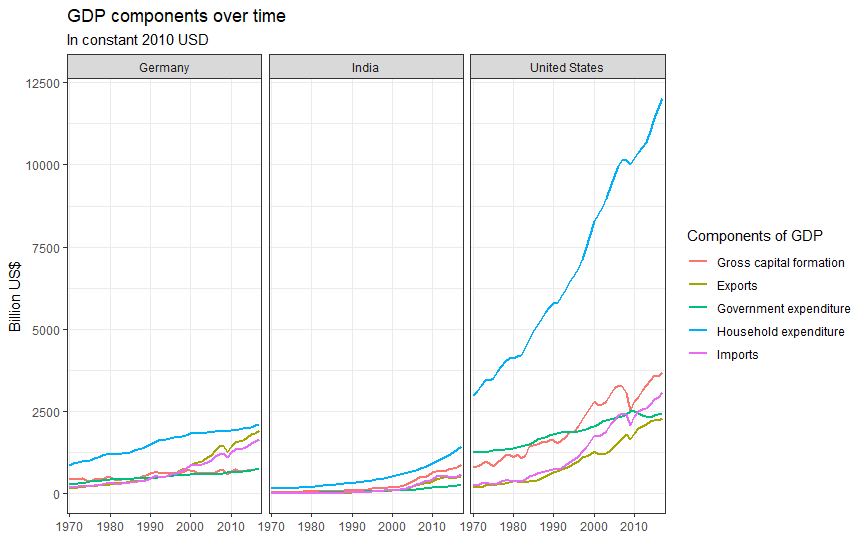
# List of indicators of interest to replicate the graph. These are stored under the Indicator name column
indicator_list = c("Gross capital formation",
                   "Exports of goods and services",
                   "General government final consumption expenditure",
                   "Household consumption expenditure (including Non-profit institutions serving households)",
                   "Imports of goods and services")

tidy_GDP_data %>%
  # filter by country and indicator name using both lists
  filter(Country %in% country_list)%>%
  filter(IndicatorName %in% indicator_list)%>%
  # grouping by indicator
  group_by(IndicatorName)%>%
  # plotting
  ggplot(aes(x=year, y = value, color=IndicatorName, group=IndicatorName))+
  geom_line(aes(x=year, y = value, color=IndicatorName))+
  facet_wrap(~ Country)+
  theme_bw()+
  theme(legend.position="bottom",
        legend.direction="vertical")+
  scale_x_discrete(breaks=seq(1970, 2017, 10))+
  labs(title = "GDP Components over time",
         subtitle = "In constant 2010 USD",
         x = "",
         y = "Billion US$")+
  scale_shape_discrete(
    limits = c(
      "Gross capital formation",
      "Exports of goods and services",
      "General government final consumption expenditure",
      "Household consumption expenditure (including Non-profit institutions serving households)",
      "Imports of goods and services"),
    labels = c(
      "Gross capital formation",
      "Exports",
      "Government expenditure",
      "Household expenditure",
      "Imports")) +
  NULL
Secondly, recall that GDP is the sum of Household Expenditure (Consumption C), Gross Capital Formation (business investment I), Government Expenditure (G) and Net Exports (exports - imports). Even though there is an indicator Gross Domestic Product (GDP) in your dataframe, I would like you to calculate it given its components discussed above.
# changing tidy_data to wide. Degrouping Indicator names to allow for easier calculations between these.
UN_GDP_estimation = tidy_GDP_data%>%
  select(1:5)%>%
  pivot_wider(
    names_from = IndicatorName,
    values_from = value
  )

# Creation of new column, expected_GDP, which is the result of the euquation provided above.
UN_GDP_estimation = UN_GDP_estimation %>%
  mutate(expected_GDP =
           UN_GDP_estimation$`Household consumption expenditure (including Non-profit institutions serving households)`+
           UN_GDP_estimation$`Gross capital formation`+
           UN_GDP_estimation$`General government final consumption expenditure`+
           UN_GDP_estimation$`Exports of goods and services`-
           UN_GDP_estimation$`Imports of goods and services`)

# Creation of new column, percentage deviation, which is the percentage deviation between the expected_GDP column, and the GDP column reported
UN_GDP_estimation = UN_GDP_estimation %>%
  mutate(percentage_deviation = ((expected_GDP/UN_GDP_estimation$`Gross Domestic Product (GDP)`)-1)*100)

# Plot
UN_GDP_estimation %>%
  filter(Country %in% country_list)%>%
  ggplot(aes(x=year, y=percentage_deviation))+
  geom_line(group=1, size = 0.8)+
  geom_line(group=1, y=0, size = 0.8)+
  facet_wrap(~ Country)+
  theme_bw()+
  theme(legend.position="none")+
  scale_x_discrete(breaks=seq(1970, 2017, 10))+
  geom_ribbon(aes(ymin = 0, ymax = pmin(0, percentage_deviation), group=1),fill = "red", alpha=0.2) +
  geom_ribbon(aes(ymin = percentage_deviation, ymax = pmin(0, percentage_deviation), group=1),fill = "green", alpha=0.2)+
  labs(title = "Deviation of Sum of GDP Components vs Reported GDP",
         subtitle = "Percentage Deviation",
         x = "Year",
         y = "Percentage Deviation",
         caption = "Green: Higher Calculated GDP than reported GDP \
         Red: Lower Calculated GDP than reported GDP")+
  NULL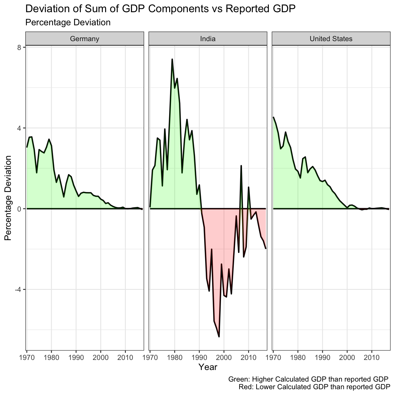
What is the % difference between what you calculated as GDP and the GDP figure included in the dataframe?
For both Germany and the US, the calculated GDP was higher than the reported GDP from the 1970’s to the 2000. This difference was highest in the 70’s, of around a 4%, and has steadily decreased over time. Since the 2000’s, both countries report a GDP that is consistent with the sum of its components, thus having an almost 0% deviation.
India on the other hand still has fluctuations on the percentage difference between the reported and calculated GDP. From 1970 until 1990, it reported a lower GDP than its calculated, peaking at a difference of 7.41% in 1979. However, from 1990 until this day, India reports a higher GDP than the sum of its components, except two exceptions in 2007 and 2010. In 2017, the last datapoint available, India’s reported GDP was 2% higher than its calculated.
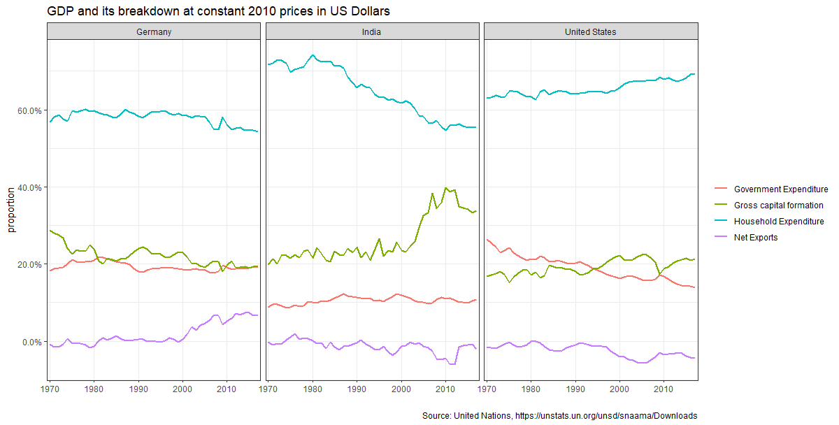
What is this last chart telling you? Can you explain in a couple of paragraphs the different dynamic among these three countries?
In Germany, during the past years, the proportion of their GDP attributed to net exports has increased, while the proportions of all other elements of GDP have decreased. This might be a result of Germany’s strong exports in industries such as automobile, driving the economy of the country. The US has seen a steady increase in the proportion of household spending, reducing government expenditure. Lastly, India has seen a sharp increase in the proportion of gross capital formation, with a decrease in household expenditure. This might suggest an entrepreneurial trend among Indians, who prefer to invest capital than to spend it.
Furthermore, household income is the largest contributor of GDP in all countries, while net exports is the lower. Government expenditure and gross capital formation represent a similar proportion in the US and Germany, while in India gross capital formation appears in a larger proportion.